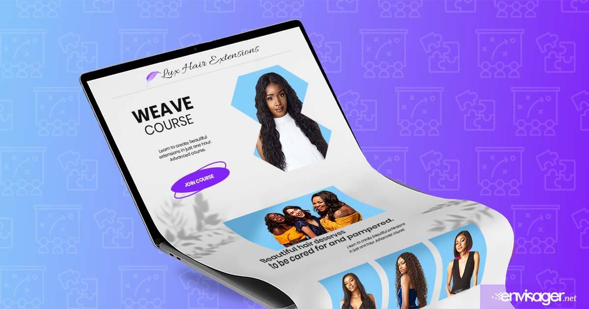
Landing Page Design: Tips and How To Use Them
A landing page is a standalone webpage design. Potential customers can ‘land’ on this page when they click through from an ad, email, or other digital location.
As a small business owner, you understand the effort involved in reaching potential customers. In fact, you’ve spent a significant amount of time determining your ideal marketing mix. After working hard to gain your audience attention, how do you actively convert them into customers?
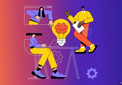
One of the most effective ways to increase leads and sales is by building a landing page design. This single web page is specifically used to promote an offer and generate conversions.
9 Landing Page Design Tips
If you’re on the web any amount of time, you’ve obviously seen a landing page design. However, building one yourself is a different ball game.
In this article, we’ll provide guidance on landing page design. You’ll also find helpful tips to assist you through the creation process. After using this information, you should be able to build a high-converting and attractive landing page design.
01. Use Minimal Text
While some text is required to describe the offer, keep it to as few words as possible. The idea is not to overwhelm visitors with too much information in the form of text.
In general, use the most essential information about the product without expanding into several paragraphs. It’s more like a show and tell. So, let your images do most of the talking. Then your text and headlines can act as supplemental information. And since you’re using minimal amount of text, your phrases need to be engaging and concise.
02. Create A Simple User Interface
A big point to consider is having a clean and simple layout. In a word, the best landing page designs are simple, thus no issues with clarity. Therefore, avoid clutter which makes the page difficult for visitors to skim and digest.
And using plenty of white space and sections are your best friends. But even using sections don’t cram lots of information in them. For instance, if you’re including a signup form, keep the number of fields to a minimum. With this in mind, you only need the visitor’s name, email address, and maybe their job title.
03. Write a Powerful CTA
As mentioned above, one the main reasons for a landing page design is ‘conversions’. And the most crucial component for conversion is a call-to-action (CTA).
In addition to being an important best practice, this button or graphic tells visitors take the next step. For example, your CTA should be a Download Now button for an ebook. Or Buy Now button to make a purchase. Whatever you choose as your CTA, it should direct visitors toward completing the main objective of your landing page.
Not only should CTAs be simple, but they should clearly communicate value. Use aesthetically-pleasing and eye-catching buttons or graphics. Your CTA button should also be in an appropriate contrasting color. Additionally, place it in a highly visible location such as in the header or close to it.
You may also want to include your CTA multiple times throughout your landing page. For instance, at the top, middle and bottom of the page. This provides visitors multiple opportunities to access the offer without having to scroll too far in either direction.
04. Stay Clear of Long Scrolls
Albeit you may have a beautiful landing page design, no one wants to scroll into oblivion. In fact, everything visitors need to see should be in the top fold before they ever start scrolling. Hence, short amount of text, inviting heading, and a strong CTA so that it fits in the first fold.
If your offer is complex, requiring more detail, using lightboxes would be ideal. That way, you don’t end up with a super long page and they provide an optimal user experience.
05. Use Your Brand Colors
Although it can be tempting to start mixing colors for a more exciting page, don’t. Stick with your brand colors to enhance brand recognition. Unless you’re using shades of your brand colors, your landing page colors should be same as your main website’s colors.
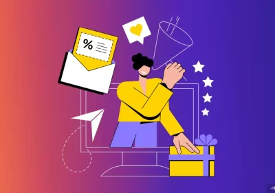
06. Choose Enticing Visuals
Your visuals alongside your colors should attract and engage visitors. This not only makes it easier to digest your content, but also catches visitors’ eyes.
Moreover, your visual elements should be consistent with your brand. Whether using photographs or graphics, make sure they’re staged in the same way as those on your main site. And videos should also have the same tone, overall feel and style of your brand.
07. Keep Visitors Focused on the Page
This page is not about other pages on your website. Consequently, don’t include links to other pages of your site. The idea is to have visitors only click on your CTA that specifically pertains to this landing page design.
Given these points, do not use your main site’s navigation menu on this landing page. Obviously, that makes it easy for visitors to be distracted and leave the page where your CTA is.
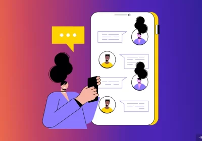
08. Include Social Sharing
No, this is not the same thing as links to other pages on your main site. Enabling social sharing provides a way for visitors to share the specific content of your landing page only. When social sharing is enabled, those who share it spread the word to their followers.
Usually, these share buttons should added to the top fold alongside the other offering main content. Some of the most popular options are Instagram, Pinterest, Twitter and Facebook.
09. Run A/B Testing On Your Design
There are numerous best practices for optimizing your page. However, consumer behavior can be surprising. If you’re unsure about your landing page design, you can run an experiment to test different versions of your pages.
Show slightly different versions to different people. For example, change the colors and position of the CTA and see which one convert best. To know what you’re aiming for, the average conversion rate for landing pages is 9.7% or higher.
After reading the above, if you don’t feel confident about designing your own landing page, we can help. Reach out to our expert web design team at (858) 874-6528. Or contact us online to discuss your goals.
You may also enjoy reading: The 5 Best Loyalty Cards For Small Business

Dr. Amelia Davis
WEB DEVELOPMENT DIRECTOR
Dr. Amelia Royster-Davis is a Doctor of Education and an Instructional Designer. As the Director of Web Development at Envisager Studio, her primary focus is to lead the web development team in building modern, responsive websites. In her spare time, she writes about web development, UI and UX.
Related Posts