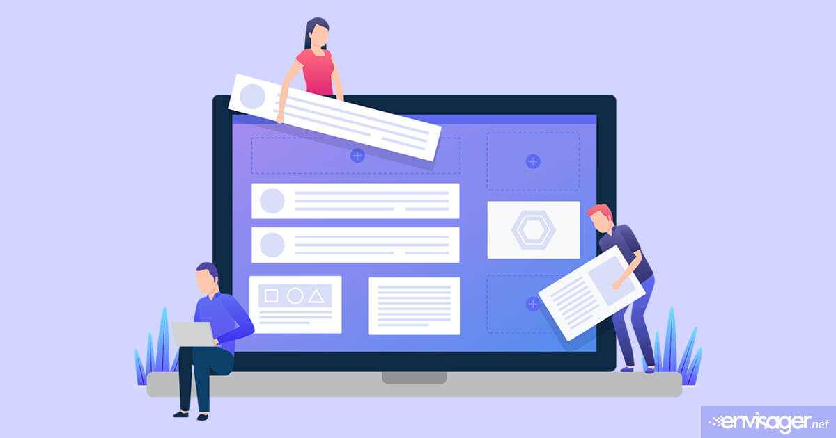
Dos and Don’ts Of Website Homepages: Homepage Best Practices
Generally, the homepage is usually the first exposure that a prospect has with your business. For this reason, it’s important to make sure you implement homepage best practices for your website.
One of the most important things about your homepage is that it should drive visitors to the right places on your website. If it’s cluttered with excess information, it will be more confusing than helpful to your visitors.
Read on to learn more about the purposes of your homepage and homepage best practices to follow for effective website design.
What Is The Purpose Of A Homepage?
The purpose of a website homepage is to introduce website visitors to your brand, products, and services. As such, it should include who you are, what you do, and how you can help them. Given that it’s the virtual entrance to your company, the homepage is responsible for captivating your audience. For these reasons, your homepage should be optimized properly.
It is not the place to go into details, but rather give your visitors a preview of how you can help them as they go deeper into your site. With effective design and copy, your homepage becomes guide to all that you have to offer your visitors.
8 Homepage Best Practices
- DON’T use too much text. Make it easy for visitors to find what they’re looking for. Since the average time spent on a website 52 seconds, you have less than a minute to engage your audience. Break up your text with white space and images, and format your text with headers to increase scannability.
- DO use your logo on your homepage. Your business logo is the foundation of your brand identity. Therefore, the more you use it, it quicker prospects will recognize your brand on social media and other platforms.
- DON’T use too many different fonts. Fonts are not just a decorative item, but rather provide visual cues for your visitors. For example, fonts let readers know what is a header, subhead or content. While there are a plethora of different fonts, it’s best to limit the usage to three. Otherwise, visitors lose that sense of visual hierarchy, not to mention make your page look cluttered.
- DO give an overview of what you offer.. Resist the temptation to go into details about your offerings. Instead, briefly show the different components of your products, services, and brand. Then make it easy for your visitors to learn more.
- DON’T clutter your homepage. Be careful not to put too much information on your homepage. When visitors land on your homepage, they’re in a scanning mode where they want to get specific answers. Therefore, too much content on the page can be overwhelming, distracting, and uninviting.
- DO include reviews. Including testimonials and reviews on your homepage help establish trust and credibility early in the user’s visit. Over half of consumers read 4 to 5 reviews before making an online purchase. So, make it easy for site visitors to make a purchasing decision by including reviews on your homepage.
- DON’T use irrelevant imagery. Since images captures a visitor’s attention before text, it’s very confusing for them when your images don’t complement your text. Also, use high quality photos and make sure the resolution is suitable for the web such as 72 ppi or 96 ppi maximum.
- DO hire a website designer to ensure an excellent website homepage. To ensure all of these homepage best practices are met and exceeded, hire a professional website designer. If designed effectively, it will engage and cover website visitors. At Envisager Studio, we are experts at building websites that engage your audience, profiles your brand, and look unique from your competitors.
So, What Makes A Good Homepage?
Your website homepage is a critical component of your site. As such, it is where first-time visitors start their journey with your brand. Given these points, here’s what makes a good homepage.
- It introduces you, your products and services.
- Well-designed, functional, and aesthetically pleasing.
- A logical flow and pattern is implemented.
- It shares the most important information about your brand.
- Content is organized and not overcrowded.
- A mix of text and visuals are used.
- It’s clear and concise.
- Directs site visitors to other pages on your website.
- It is designed and formatted for easy navigation and scanning.
Wrapping It Up
In short, one of the best website homepage best practices to remember is that it is not meant to be the end-all of everything that is on your website. Instead, it’s should be a means for visitors to quickly determine if you can solve their problem, if they can trust you, what you’re about, and what you offer.
If you’re looking to redesign your homepage, or need a full website redesign, feel free to reach out to us for more information.
You may also enjoy reading: Will mCommerce Take Over Desktop Shopping?

Christina Davis
WEB CONTENT DIRECTOR
Christina is the Web Content Director at Envisager Studio. She leads the content creation process and ensures tone and key messaging personifies the client’s brand and engages target markets. In her spare time, she writes about content marketing, content management, and website content.
Related Posts