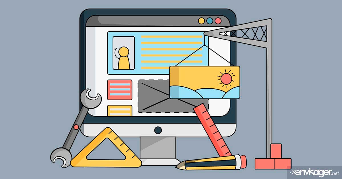
Do’s and Don’ts Of Effective Website Design
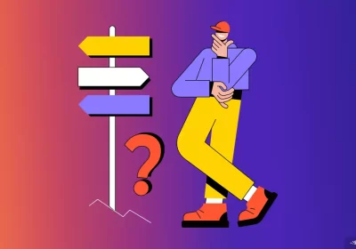
It can be extremely challenging if you’re not a professional website designer to try to create an effective website design. While themes and templates can be helpful, you will still need to know and understand the basic rules to creating a website.
There’s also the issue of competition websites where you will feel that everyone else’s site looks better than yours. Not to mention, with the rapid changes in technology, you will have a short time to understand and implement best practices before they change to something else.
Do’s and Don’ts Of Effective Website Design
In this article, we’ll discuss some basic do’s and don’ts of effective website design. We will also discover four top elements of web designing and the do’s and don’ts of each. So, let’s get started.
01. Navigation
Your website’s navigation is like a sitemap and thus, one of the most important elements on your website. Because without a well-structured navigation, visitors will not be able to find what they are looking for.
Do’s of Website Navigation
- Always use known words in navigation.
- Only insert links for useful pages.
- Tailor navigation to screen size.
- Use clear labels
- Always use contrasting text color.
- Link directly to your content.
As professional website designers, we all want our websites to be as unique as possible. But some designers will show their creativity at the expense of user-friendliness. Because website navigation is so important, simplicity is the key to its usefulness.
Don’ts of Website Navigation
- Never change the navigation of each page.
- Don’t have tons of sublinks.
- Forget about being fancy, keep it simple.
- Don’t hide critical navigation.
02. Website Layout
Another important do’s and don’ts of effective website design is its layout. For this reason, the layout should be thought through before you begin designing your website. The structure of your website depends on frameworks, grids, and patterns. As such, they provide a clear path within each page so that elements complement each other.
Do’s of Website Layout
- Use complementary design elements.
- Focus on user-friendliness.
- Follow user experience standards.
An important aspect of web design is to enhance the user experience (UX), and not impede it. And one of the steps to making that happen is to create familiar UX. Having common design elements avoids users from having to waste time figuring out the meaning of your components.
Don’ts of Website Layout
- Don’t use extremely complex layouts.
- Avoid clutter.
- Don’t focus on creativity and forget about the basics.
Creativity in web design is great because it shows the designer’s skill. However, it should never be an impediment to your user’s experience. That’s why most web design experts use a blend of new layout with those that are familiar to their audience. Even big brands like Google have fairly simple layouts for their Analytics, Meet, and their other platforms’ landing pages.
03. Typography
If we have to choose which do’s and don’ts of effective website design is important, typography would be in the top five list. When it comes to creating business websites, fonts, colors, and images need careful consideration. Not only does typography play a critical role in brand perception, but choosing fonts should never be an afterthought in the design process.
Do’s of Typography
- Set main page titles large.
- Put ample space between text elements.
- Choose fonts that align with your brand style.
Don’ts of Typography
- Don’t use more than 3 different fonts.
- Avoid using unattractive fonts.
- Don’t use full capitals for huge blocks of text.
The key to selecting fonts for a business website is to use the fonts that are specified in your brand style guide. If you or your website designer didn’t create one, you should. Creating a brand style guide ensures that colors, messaging, logo usage, typography, etc., are holistically defined for your company’s branding.
04. Contrasting Backgrounds
Website backgrounds increase your website’s visual appeal, as well as having a positive impact on site visitors. They help web designers to boost the usability of websites in many ways.
Do’s of Website Background Design
- Use large titles for extra pop.
- If you don’t have proper images, use gradients.
- Blend images into the background.
- Use illustrations or a splash of color as eye-catching elements.
- Pay attention to contrast; if text is white, the background should be dark.
Don’ts of Website Background Design
- Avoid cluttered or busy images
- Don’t use low quality images for background.
When using an image versus gradients for your website background, make sure that the image can scale nicely. For instance, choosing a super wide image may not scale well on a small mobile phone screen.
If you going with gradients for your backgrounds, choose colors that blend well together. And as a safe do’s and don’ts for effective website design, make sure that if you use a bright color, the other color should be able to tone down the gradient brightness. Otherwise, too much brightness in a large area overstimulates the retina which can cause eye strain.

Hazel Burgess
FOUNDER/SEO DIRECTOR
Hazel is the Founder & SEO Director at Envisager Studio, a premier website design agency specializing in WordPress website design, development and internet marketing. In her spare time, she writes about search engine optimization, website design, and internet marketing.
Related Posts