Difference Between Responsive Web Design vs Adaptive Web Design
If you’ve been trying to decide between a responsive web design and an adaptive web design, this article will help. This blog post will guide you through the fundamental differences between responsive websites and adaptive websites.
Each of these website design types have basic requirements. For example, one of the essential design elements of responsive web design is a fluid grid system. On the other hand, adaptive web design uses multiple fixed layout sizes.
While they both focus on mobile friendliness and user experience, there’s a ‘best time’ to use each. With this in mind, let’s explore more about responsive websites and adaptive websites.
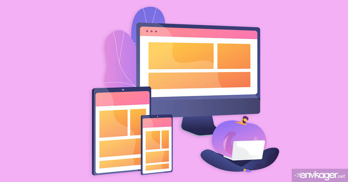
What Is Responsive Web Design?
It may seem longer, but it was just in 2011 when the term responsive web design was introduced. Responsive websites are designed in a way that seamlessly responds to the screen size of the device being used.
The amount of content on a website with responsive layout is shown based on the available screen space. And how that content behaves depends on the browser. For instance, some web designers will focus their code more on Internet Explorer or Microsoft Edge browsers. Not sure why, but one reason could be because of the nature of the content.
But, mobile friendly websites should adapt to all browsers and not be designed for specific browsers. With this in mind, there are some instances where coding is complicated due to the client’s requirements. In this instance, it may be best to focus on specific browsers. Particularly if the clients’ audience uses a certain browser more than others.
Either way, the content should freely move to self-arrange the elements so they’re optimized for the browser window. In fact, this happens automatically on mobile devices. In essence, the site checks the available space before presenting the optimal layout of the website.
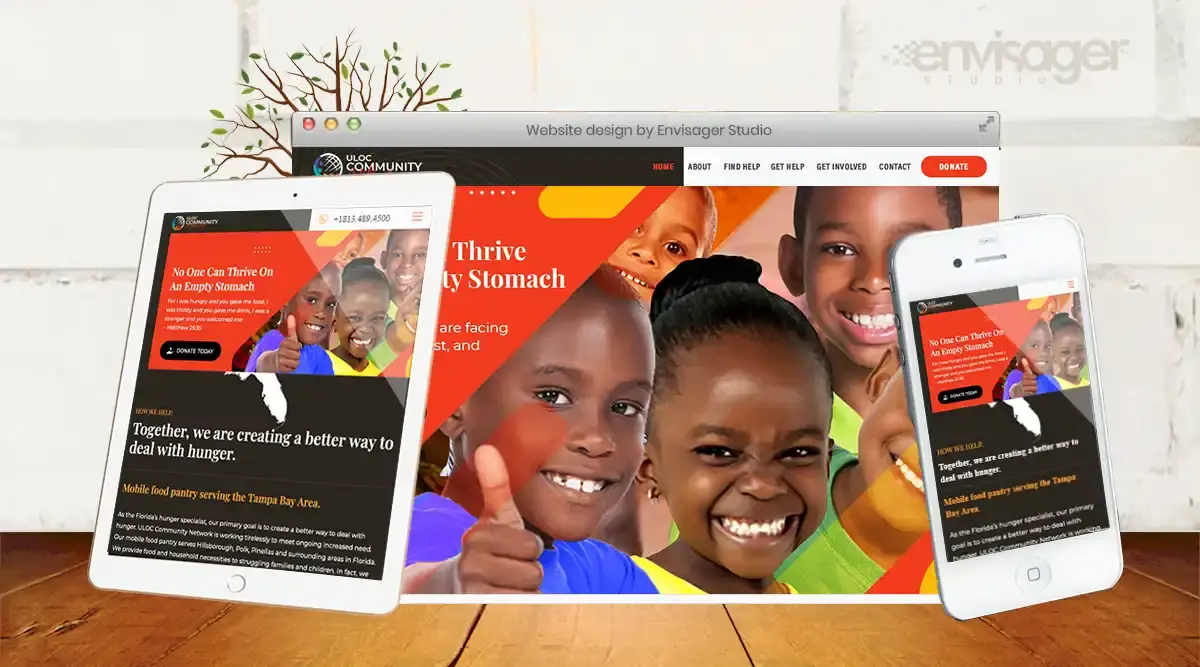
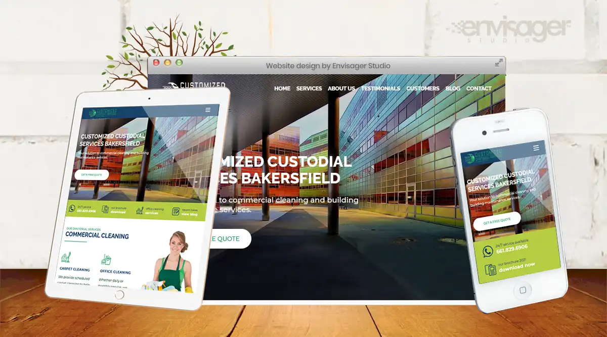
Examples of websites with responsive design
Below are just two of the many beautiful responsively designed websites we built for clients.
Pros and Cons of Responsive Web Design
Now that you have a better understanding of what responsive design is, let’s look at their pros and cons.
PROS
- The design process requires less time.
- Many WordPress themes are available due to its popularity.
- A responsive layout is better for search engine optimization compared to an adaptive layout.
- Because responsive websites uses a single URL, this feature solves problems before they occur.
- Responsive design provides consistency across all devices which is a crucial factor for optimal user experience.
CONS
- Although responsive websites tend to load a bit slower than adaptive, this can be rectified. For example, optimize images, use caching tools, and not use bloated plugins.
- Sometimes, body text can become too small because elements have to move around. But again, this can be rectified by setting the appropriate font size in CSS files for mobile.
- Websites with responsive design takes longer to developed because they have many moving parts. As a result, lots of auditing and tweaking is required during the development process before taking the site live. This is because a responsive website must be able to self-arrange to fit any screen.
About Adaptive Web Design
Also know as ‘progressive enhancement of a website’, adaptive web design was also introduced in 2011. Unlike responsive sites, adaptive websites have multiple fixed layout sizes. After determining the available device screen space, this design selects the most appropriate layout per device screen. For this reason, the browser has no impact on adaptive layouts.
For example, when you open a browser on a tablet, the site will select the best layout for that screen. Big brands such as Ikea, Apple, and Amazon websites use adaptive design and they are optimized for mobile browsing.
So, what are the pros and cons of adaptive web design?
PROS
- This type of design gives web designers more control over each layout. Ultimately, creating the most optimized design for each screen size.
- Generally speaking, adaptive websites load fast.
CONS
- The multiple layouts creates duplicate content, thus can negatively affect SEO.
- Requires lots of design/development time and is a tedious process.
If you’re not sure which type of website design is more suited to your business, we’ll happy to help. Get in touch with our team today for a free website design quote.

Dr. Amelia Davis
WEB DEVELOPMENT DIRECTOR
Dr. Amelia Royster-Davis is a Doctor of Education and an Instructional Designer. As the Director of Web Development at Envisager Studio, her primary focus is to lead the web development team in building modern, responsive websites. In her spare time, she writes about web development, UI and UX.
Related Posts