The folks at Common Sense Hair Loss believes that hair loss prevention is a lot simpler than treating hair loss. Unfortunately, most people think about preventing hair loss only after they have lost a lot of it. While some products help with regrowth, the idea is to prevent it from happening in the first place. This messaging is why the owner approached us about a hair loss prevention website design for her business.
Services provided:
WEBSITE DESIGN + DEVELOPMENT
SEARCH ENGINE OPTIMIZATION
LOGO DESIGN + BRANDING
WEBSITE MAINTENANCE
About the project
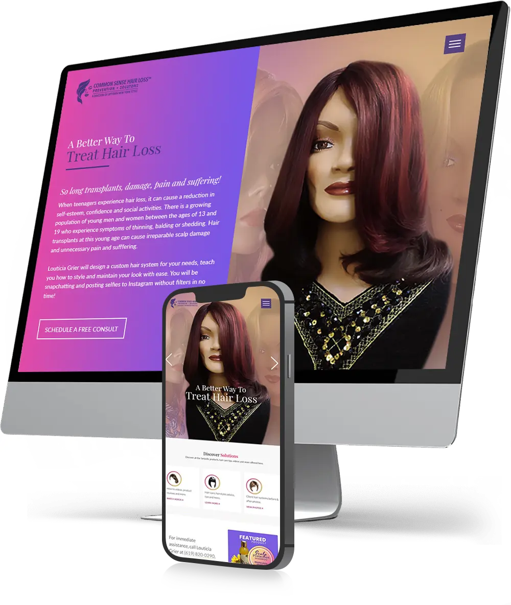
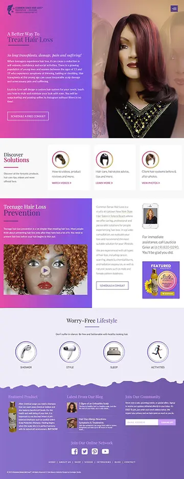
COMMON SENSE HAIR LOSS: PREVENTION NOT TREATMENT
Louticia contacted Envisager Studio to establish an online presence with an informative hair loss prevention website design. At the forefront of their business is consumer awareness. They were looking for a dynamic website that could be kept up-to-date with content regarding hair loss. In order to meet the client’s request, our design team had to strike a balance between compassion and professionalism. In short, the message had to speak to their qualifications without being overbearing.
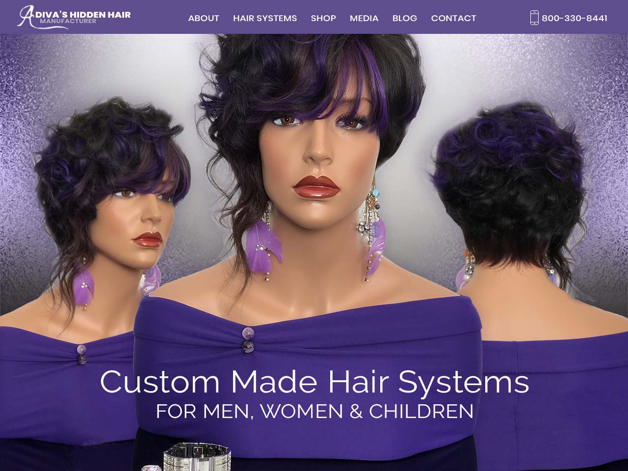
For the logo, the client wanted to be direct with graphics that represented hair. The logo design is inspired by a content woman who feels she can do anything with her healthy hair. Our design team chose to use minimum gradient on the symbol, but brand name and slogan is a solid purple color from the gradient mix. We also wanted to keep the typeface simple given the seriousness of the subject. As such, we used sans typography as it is very legible and easy to read.
To establish the serious, yet soft tone the client was looking for, this hair loss prevention website uses bold colors and contrasting structures in the design. The purple plays a unique role in the website aesthetic and are further emphasized but solid white background. In addition, the inclusion of imagery that does not conform to block standards, adds a more lighthearted tone to an already clean design direction.
Along with the composition and color choices, the Montserrat sans typography is very crisp, drawing in the viewer’s attention. And the text itself speaks to the integrity of the business by highlighting services and topics in careful detail. Plus, within each page, keyword integration offers excellent SEO potential.